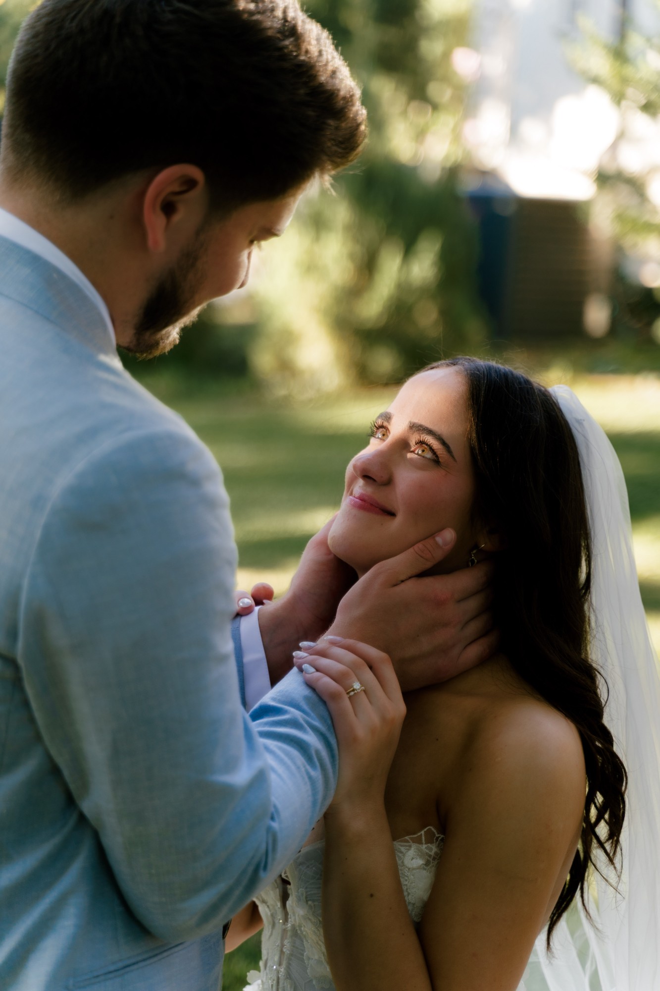
Journal · 12 October 2026
Timeless vs trendy: photographs you will still love in thirty years
Pick up any wedding album from thirty years ago. Some pages still stop you. Others make everyone laugh, kindly. The difference is rarely the people. It is the effects that were fashionable that year.
I think about albums like that a lot when I edit. The question I ask is simple: will this couple still love this frame when their children are grown? Here is how I try to answer it, and where I think honest photographers can disagree.
First, an honest admission
Every photograph shows its era. The dress, the hair, the phone in someone's pocket. You cannot make a picture that floats outside time, and I would not want to. Your wedding happened in a real year, and that is part of the story.
So "timeless" does not mean "no trends". It means the photograph does not depend on a trend to work. Strip away the edit and the moment is still there. That is the test.
What actually ages badly
Look back through old galleries and the same few things date a picture fastest. Almost all of them are added after the shoot.
- Selective colour. A black and white frame with one red bouquet. It belongs to a single moment in the 2000s.
- Heavy skin smoothing. Faces that look like plastic, and lace that has lost its detail.
- Strong filters. Sepia, cross processing, and the presets everyone used at once.
- Extremes of either pendulum. Bright and airy pushed until the dress has no texture, or dark and moody pushed until you cannot see faces.
- Orange skin. Warmth is lovely. Skin that looks tanned by software is not.
The pattern is that each one is a stamp from a tool, not a quality of the light. When the tool goes out of fashion, the stamp stays.
Light: the part that never goes out of date
If I had to give one piece of advice, it would be this: plan your day around the light, not around the edit.
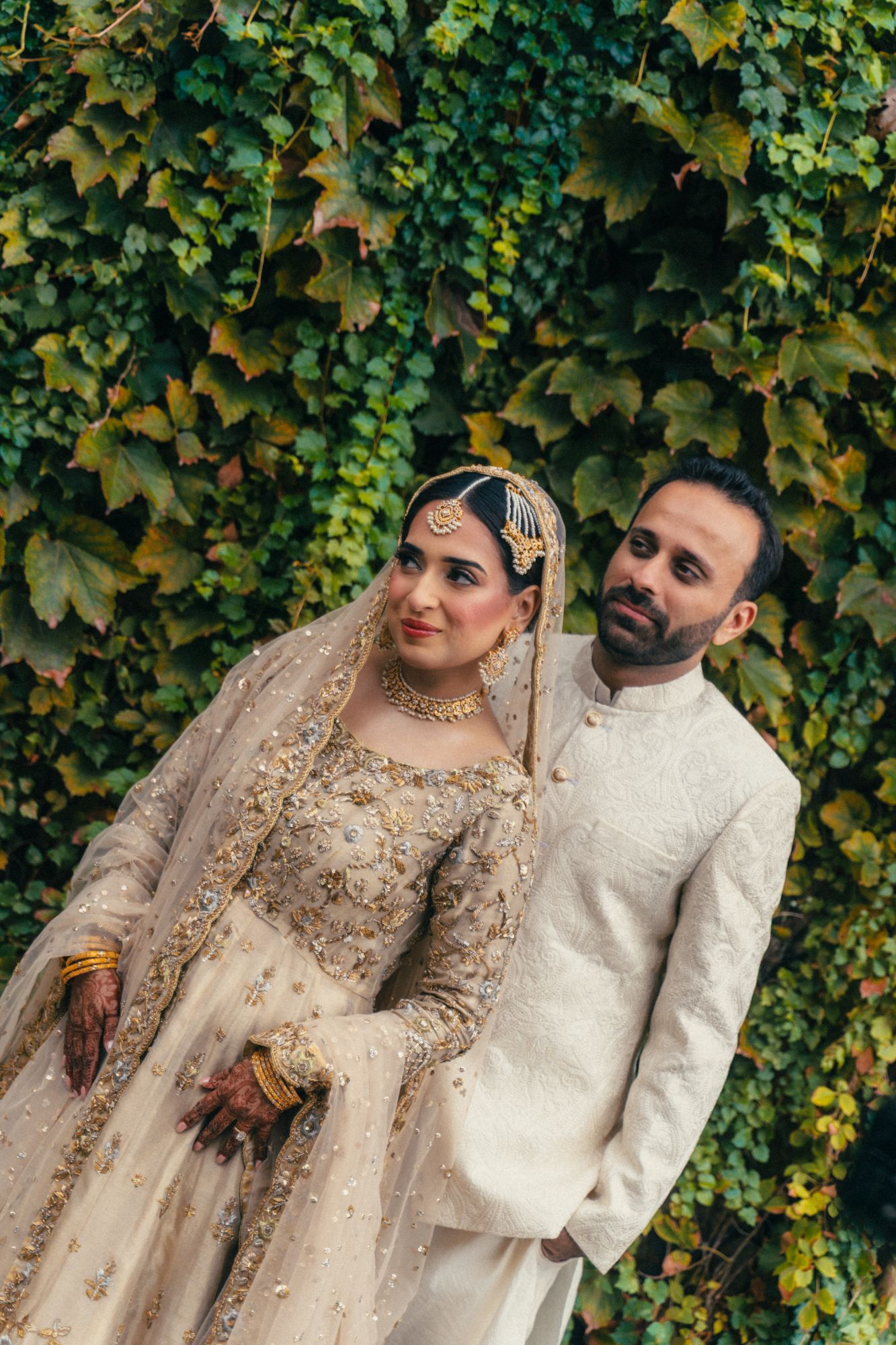
Low evening sun, open shade, a window, a grey sky. These look the same in 1960 and in 2060. The light on Fahmeen and Ali came from a soft overcast afternoon. I did almost nothing to it, because there was nothing to fix.
In Dallas this matters more than in England. Midday sun here is hard and directly overhead. It creates dark eye sockets and squinting. No preset solves that. So I time sessions to end as the sun goes down, and on wedding days I look for shade and doorways in the middle of the afternoon.
Direct flash is the one I am careful with. It is having a moment, and in a dark reception it can be honest and fun. But as a default look across a whole gallery it is the most date stamped choice you can make. I use it on purpose, for a handful of frames, not as a style.
Colour: honest skin first
My work is muted. I like quiet greens, soft whites and a little warmth. But muted only lasts if two things are right.
- Skin must look like skin. Not orange, not grey, not pink. If the skin is true, the rest of the palette can be quiet.
- Greens must stay alive. Desaturate grass too far and it looks dead. Texas summer green is already a little dusty, so I am gentle with it.
Whites should be white, or very close. A wedding dress is the brightest thing in most frames, and it is the first thing that shows a colour cast years later.
The film look, and teal and orange
This is where I think fair people disagree, so I will give you both sides.
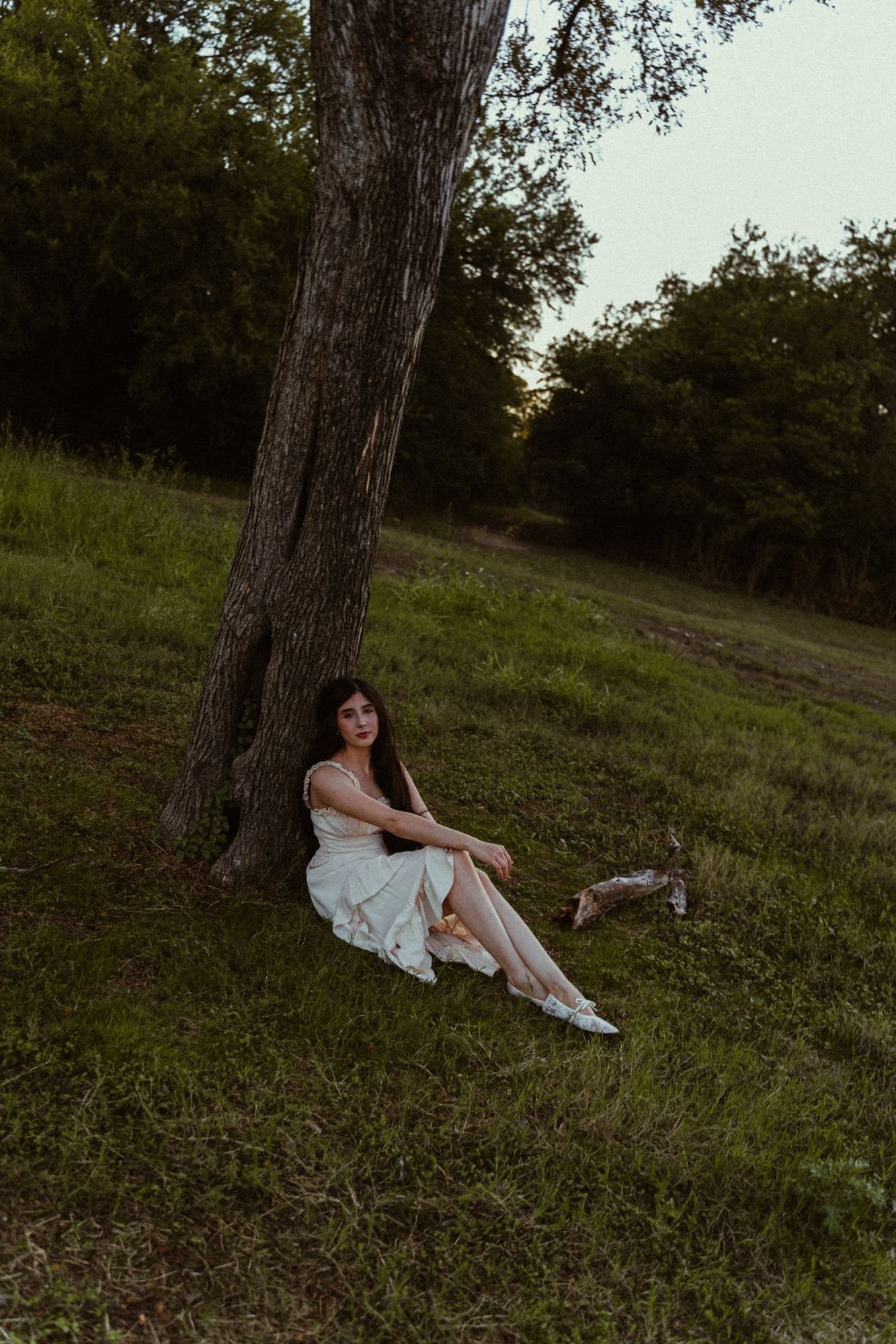
The film look is what I love. Soft highlights, gentle contrast, a little texture, colour that feels like memory. I shoot on Sony digital and edit towards that feeling. To me it reads as light, not as a filter. But I know that some of today's film emulation will look like "the 2020s" one day, the same way sepia looks like the 2010s now.
Teal and orange is the same. Cinema has used it for decades, and in a subtle form it can look rich and grown up. Pushed hard, skin goes orange and every shadow turns blue.
So I do not call either one dated. I call them contested. The answer is restraint. A little texture, kept consistent across the gallery, has aged well for a hundred years. Heavy fake grain and crunchy colour will not.
Posing: give people something real to do
The poses that date fastest are the ones that look arranged. Hands placed for the camera, heads tilted the same way, a pose copied from a board.
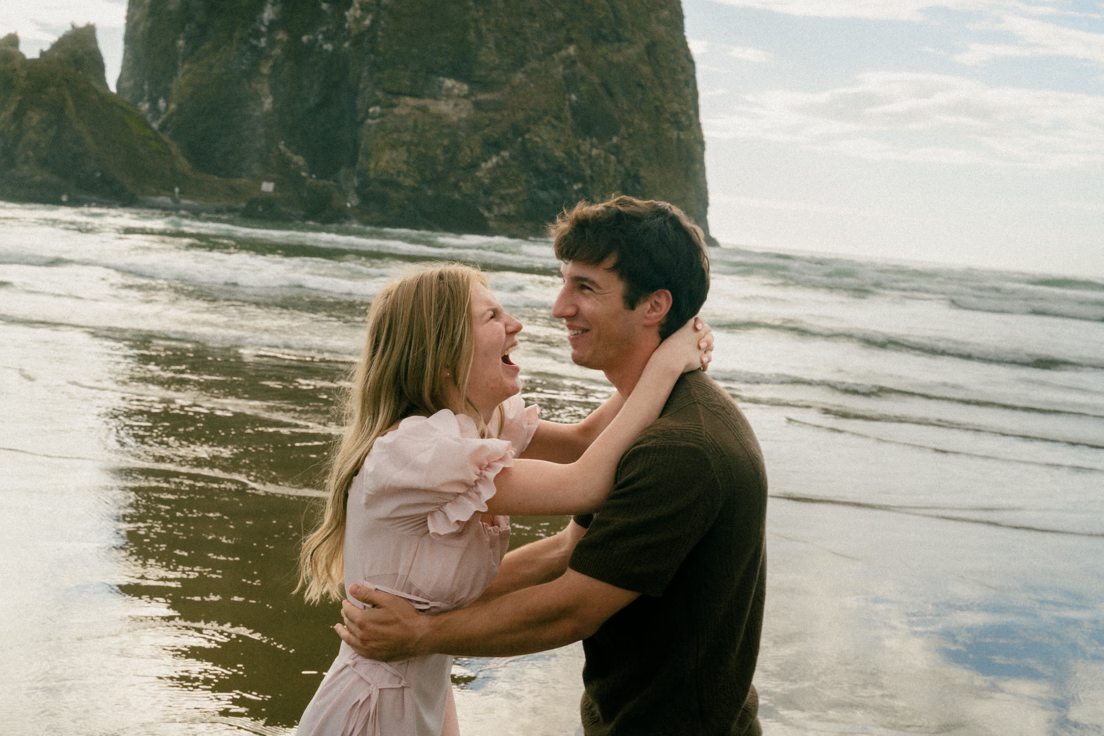
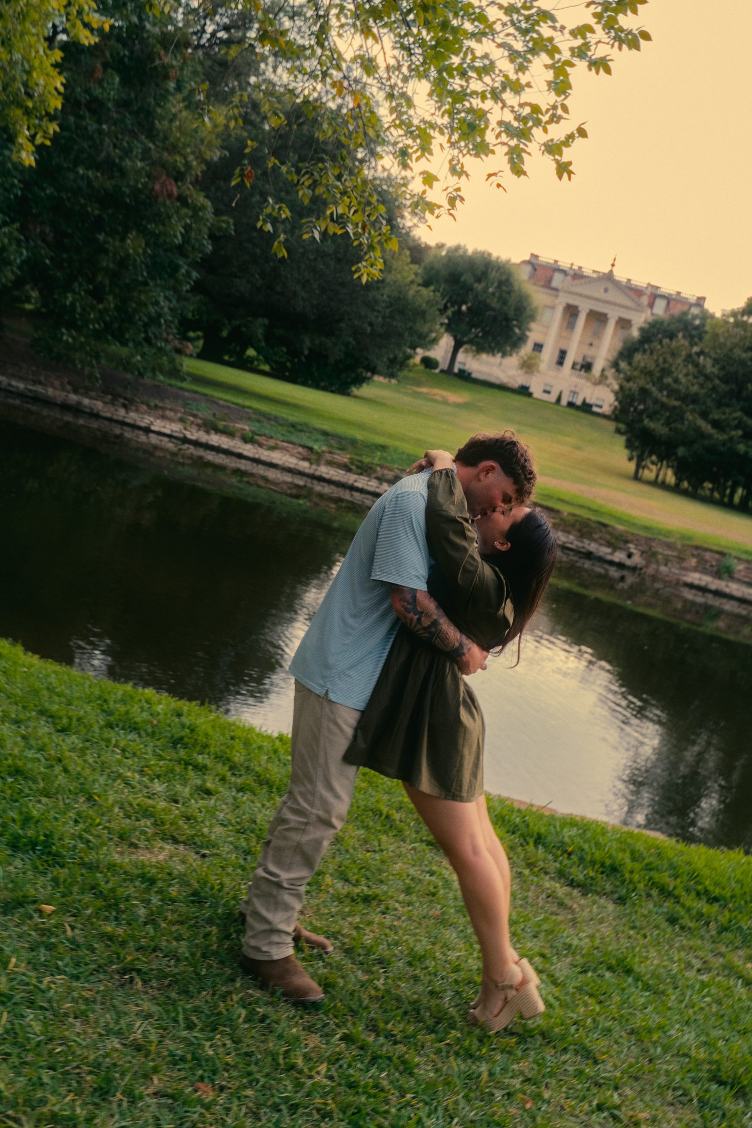
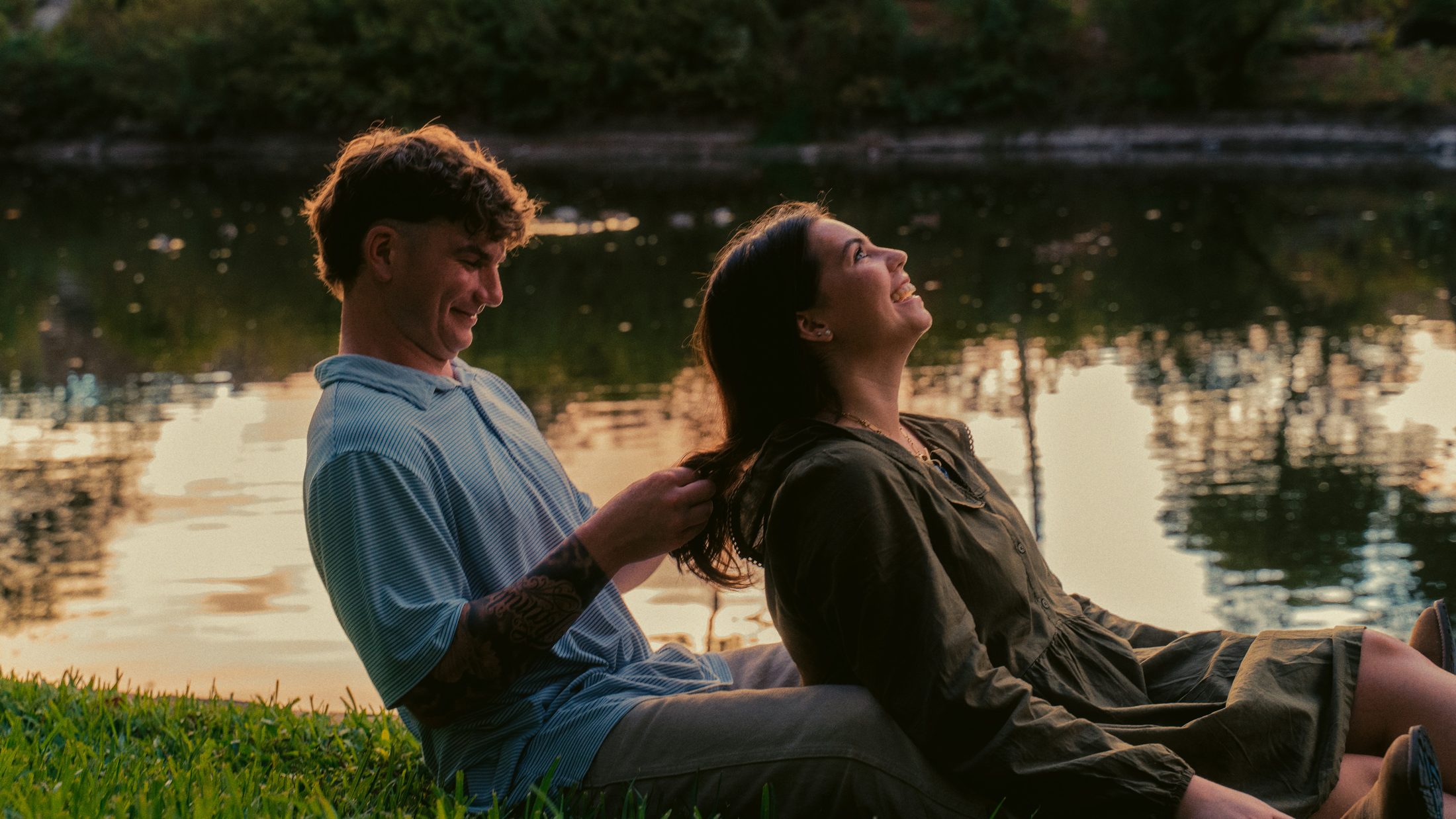
What lasts is body language between two people. Holding, leaning, laughing, looking at each other rather than at me. I give couples somewhere to stand and something to do, then I get out of the way. Frankie and Simon above was not a pose. It was the moment after I asked them to walk towards the water.
I still direct. Most people do not know what to do with their hands, and that is fine. But I direct towards a real moment, not a shape.
A good gallery mixes both: a few guided portraits your grandmother will frame, and plenty of in between frames that show who you are.
Wardrobe: keep the trend in the details
Clothes are where a photograph shows its year most clearly, and that is fine. A few things help.
- Simple silhouettes and good fabric. Linen, lace, wool, silk. Texture ages better than print.
- Calm colour. Creams, soft blues, sage, navy, a deep burgundy. Neon and loud logos date fast.
- Put the trend in one place. A pair of shoes, an earring, a bag. Easy to love now, easy to ignore later.
- Wear what you actually like. A dress that is really you will always feel right, even if the cut is of its time.
Fahmeen's embroidery is a good example. It is rich and detailed, but it is traditional, so it does not belong to a single season.
Editing: the easiest thing to get wrong
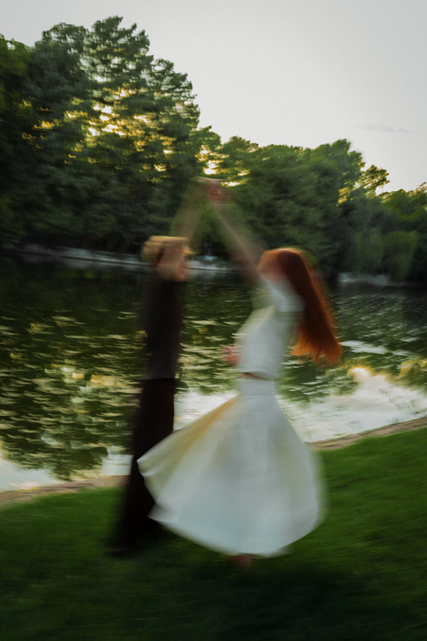
Editing is the most reversible part of a photograph, and the part people blame most when it ages. My own rules are short.
- Correct before you style. Fix exposure, white balance and skin first. Then add the mood.
- One look per gallery. A consistent grade reads as a style. A different preset every few frames reads as a phase.
- Light retouching. Remove a spot. Do not remove a face.
- Leave the shadows readable. Crushed blacks look moody now and muddy later.
- Keep the files. Your original images will outlive any edit, so keep them safe.
How to tell if a photographer's work will last
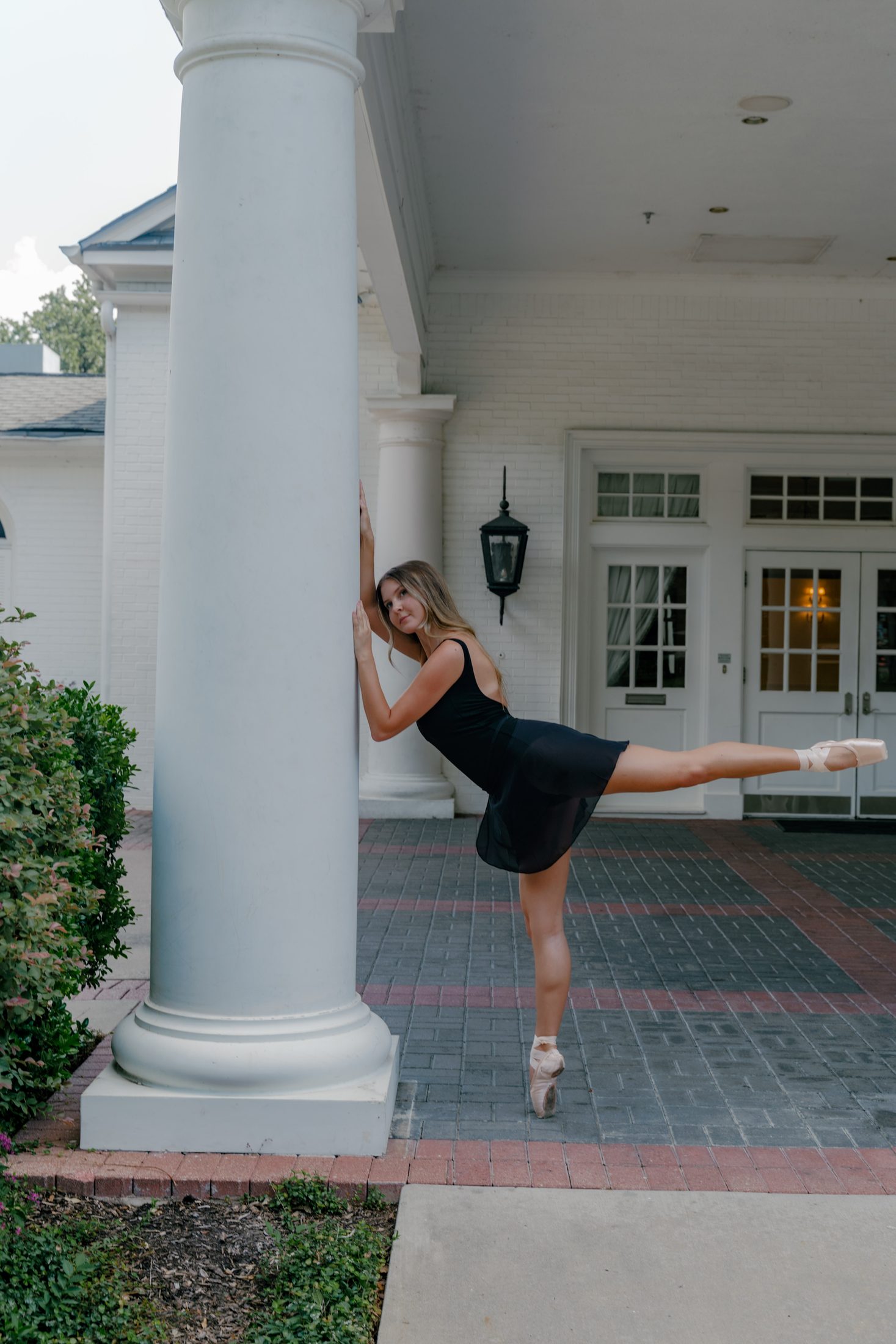
When you look at a portfolio, try this.
- Look at the skin first. Does it look like a real person?
- Look at the whites. Is the dress white, or yellow, green or grey?
- Look at a gallery, not a highlight reel. Is the look consistent?
- Ask yourself if you would like the photograph in black and white. If the moment still holds, it is a good photograph.
- Ask how they handle harsh midday light. In Texas, that answer tells you a lot.
Frequently asked questions
What makes a wedding photo timeless?
Good light, honest skin tones, real body language and a gentle edit. If the moment still works in black and white, it will probably still work in thirty years.
Is the film look just a trend?
Partly. Subtle film texture and soft colour have lasted a long time. Heavy fake grain and strong presets will date. I treat it as contested, and keep it restrained.
Is teal and orange dated?
Not yet. Used lightly it can look cinematic. Pushed hard it turns skin orange, which ages badly.
Should our photos be in colour or black and white?
Both. Colour holds the day as it was. Black and white is good for emotional moments and busy backgrounds. I mix them through every gallery.
What should we wear for photos that last?
Simple shapes, natural fabrics and calm colours. Keep any trend to one accessory.
How does Dallas weather affect the look of photos?
Strong midday sun is the main enemy. Plan portraits for the last hour before sunset, and use shade, doorways and overcast days for the rest.
If this sounds like you
If you want photographs that feel like your day rather than a filter, I would love to hear about your plans. Have a look at my weddings, see pricing, and get in touch when you are ready.
Planning a session